The real cost of cheap survey panels: How low-quality data corrupts your pricing research
·12 min read
When two panel bids land on your desk and one is 25% cheaper, the decision feels obvious. It isn’t. Cheap survey panels carry a cost that never appears in a vendor’s proposal: data compromised enough to produce directionally wrong research outputs, including pricing recommendations that can send a product launch entirely the wrong direction.
This article shows you exactly what that looks like, with actual pricing study data, and makes the economic case that the cheaper panel may turn out to be the most expensive decision you make all year, with consequences for online survey data quality that far outlast the fieldwork budget.
Short on time? Jump straight to the specific section:
What “cheap” actually means in survey panel pricing
Discussions about market research data quality often focus on post-collection cleaning. However, the problem starts earlier, at the panel sourcing stage. Panel pricing is a competitive market, and vendors who bid low are making tradeoffs that the bid sheet doesn’t spell out. Lower-cost panels typically operate with larger, less curated respondent pools. This sounds manageable until you look at what that means for your actual usable sample.
In GroupSolver’s data quality analysis
, more than 40% of responses collected through lower-quality sourcing are flagged and removed before analysis begins. Run that math against your panel bid. If you purchase 1,000 completes and 40% are removed, you’re analyzing roughly 600 usable responses — but you paid for 1,000. A higher-quality panel delivering 900 usable completes from 1,000 costs more per complete on paper, but less per clean complete in practice.
There’s a wrinkle worth knowing about. Most reputable panel providers will refund clients for respondents flagged as low-quality. Meaning, in theory, you don’t pay for unusable data. The catch is that the refund only happens when you can prove which respondents were bad. That requires detection capabilities most research teams don’t have built in, and that standard quality protocols
don’t reliably provide. Without a rigorous way to identify fraudulent or inattentive respondents, the refund mechanism quietly fails. You absorb the full cost of bad data, while the panel is technically prepared to credit you for it, you just can’t claim what you can’t see.
The incidence rate survey cost problem compounds this further. When bad respondents are removed post-fieldwork, your effective sample shrinks, which can trigger the need to re-field, extending your timeline and adding unplanned cost that never appeared in the original bid comparison.
The right question when evaluating panel bids isn’t “What’s the cost per complete?” It’s “What does survey sample quality actually cost me per usable complete?” Those two numbers often tell very different stories.
Want to see what your pricing research looks like when the data is actually clean?
The economics of bad data: you didn’t actually save that money
Here’s a scenario worth stress-testing before you approve the cheaper bid.
You choose the lower-cost panel and save $3,000 on fieldwork. Your pricing study comes back looking clean. Respondents show a strong willingness to pay, the data model points toward a premium price point, and you launch accordingly. Sales in the first quarter underperformed. You run diagnostics. By the time you identify the pricing miscalibration and correct repricing, repackaging, or reorienting sales positioning, you’ve absorbed months of margin compression and opportunity cost.
The $3,000 you saved didn’t disappear. It compounded into something much larger.
The bad survey data consequences in pricing research are particularly severe because the methodology depends entirely on respondents accurately representing their own economic behavior. And that’s precisely where low-quality respondents fail — not randomly, but in consistent, directional ways. Bad respondents showed systematically different behavioral profiles, including significantly higher claims of daily AI usage, compared to good respondents. This pattern of over-claiming extends to pricing and purchase intent questions. Consider what that chart is showing. Bad respondents were roughly twice as likely as good respondents to claim they use AI multiple times per day. That’s not a random data artifact; it’s a pattern consistent with survey panel fraud: respondents systematically misrepresenting their behavior in ways that appear plausible but don’t reflect reality. The same tendency that inflates AI usage claims also inflates willingness to pay, distorts purchase intent, and produces economic responses that no real customer would give you.
What bad respondents actually do to your pricing data
The most important thing to understand about bad survey data is that it doesn’t just make your results noisier. It pulls them in a specific direction. In pricing research, that direction is reliably upward, toward inflated price points that overestimate how much your market will actually pay.
Here’s the empirical proof.
Van Westendorp pricing research works by asking four calibration questions about pricing thresholds (too cheap, bargain, getting expensive, and too expensive) and calculating where those curves intersect to identify an optimal price point. The entire methodology
depends on respondents accurately representing how they actually perceive and respond to price. Bad respondents don’t.
In a Van Westendorp pricing research study analyzed by GroupSolver, good respondents (N=500) produced an optimal price point of $45. All bad respondents (N=843) produced an optimal price point of $100, more than double. Van Westendorp price sensitivity results by respondent quality. Good respondents (N=500) produced an optimal price of $45. All bad respondents (N=843) produced $100. Even the ’least obvious’ bad respondents (those who passed standard inconsistency checks) still produced a $75 optimal price, a $30 gap from the clean data result. A $55 gap in optimal pricing isn’t a rounding error. For a physical product, it’s the difference between capturing your core market and pricing yourself out of it. For a SaaS product, it can mean building an entirely wrong tier structure from the ground up.
The mechanism behind the distortion becomes even clearer when you look at basic willingness-to-pay behavior.
Good respondents showed expected demand-side behavior: as the price rose from $15 to $50, willingness to buy 5+ units fell from 25% to 9%. Bad respondents showed almost no price sensitivity, with purchase intent remaining flat across the same price range. Good respondents behaved exactly as economic theory predicts: as the price rose from $15 to $50, the share willing to buy five or more units dropped from 25% to 9%. Bad respondents showed almost no price sensitivity at all; their purchase intent at $15 and $50 was essentially identical (24% vs. 24%).
When a respondent’s willingness to buy doesn’t change as the price more than triples, that’s not a data point; it’s a corrupted signal masquerading as one. Scale that across hundreds of respondents, and your pricing model is built on fiction.
Why removing obvious bad respondents isn’t enough
Most research teams assume this problem is manageable with post-fieldwork cleaning. Remove the speedsters. Flag straight-liners. Discard logically inconsistent responses. Standard practice. Problem handled. It isn’t.
Go back to the Van Westendorp data. Even after removing respondents with obvious inconsistencies in their pricing answers, the kind any reasonable quality protocol would catch, the remaining “least obvious bad” respondents (N=299) still produced an optimal price point of $75, compared to $45 for the good respondent group.
A $30 mispricing gap survived a standard cleaning process
. That’s the part of the conversation that almost never happens in panel vendor selection discussions, yet it’s arguably the most important variable in the whole equation.
Bad respondents who pass basic quality checks aren’t people who clicked too fast or misread the survey. They complete surveys in ways that appear plausible, consistent enough to survive screening, but fundamentally misrepresent their economic behavior. Traditional data cleaning protocols weren’t designed to catch them, and they don’t.
That’s why sourcing quality at the panel level matters more than the thoroughness of your post-collection cleaning. You can’t screen your way out of a structurally bad sample. The research best practices
for managing this problem start before fieldwork begins, not after.
How to evaluate survey panel quality before you commit
The right framework for panel vendor selection goes well beyond cost per complete. Here’s a more useful approach:
Ask for removal rate data. Any panel provider worth working with should be able to tell you what percentage of responses typically fail quality checks on studies similar to yours. If they can’t answer — or won’t — that’s informative. Knowing your vendor’s historical removal rate lets you calculate the effective cost per clean before you commit. GroupSolver’s approach to this is detailed at groupsolver.com/data-quality
.
Understand what their fraud detection actually catches. Speed traps and red herring questions remove obvious bad actors. But as the data above shows, the respondents who do the most damage are the ones who pass those checks. Ask what behavioral and consistency-based signals are applied beyond the basics, and specifically how they address the subtler patterns associated with survey panel fraud.
Ask about refund policies and whether you can actually use them. Most quality panel providers will refund clients for respondents flagged as bad. That protection is only worth as much as your ability to identify those respondents in the first place. If your detection process catches the obvious cases but misses the subtler patterns of survey panel fraud, you’re leaving credits on the table and absorbing the cost of bad data that the panel would have refunded. Confirm both the refund policy and the detection methodology you’ll be using to trigger it.
Calculate the effective cost per usable complete. Divide the bid price by your estimated usable sample after cleaning. A panel at $2.50 per complete with a 40% removal rate has an effective cost of $4.17 per usable complete. A panel at $3.50 with a 15% removal rate costs $4.12 per usable complete. The “cheaper” panel wasn’t cheaper.
Calibrate by research type risk. Some methodologies are more vulnerable to bad survey data consequences than others. Pricing research like Van Westendorp, conjoint, or Gabor-Granger is among the highest risk because it requires accurate economic self-assessment. If your study involves pricing research
or willingness-to-pay questions, the quality requirement for your sample should be higher than baseline, not treated as a cost to minimize.
Ask for benchmarks on comparable studies. Aggregate data on bad respondent rates across similar studies (by category, methodology, and audience) tells you more than a single fielded example. Patterns reveal what a single data point hides.
Running pricing research soon? Let's talk about what clean data actually looks like.
The sticker price of a panel bid is not its real cost. Effective cost per clean, usable, complete is what matters, and cheaper panels often lose that comparison once removal rates are factored in.
Bad respondents in pricing research don’t add random noise. They introduce directional bias toward inflated price points. In empirical analysis, bad respondents produced Van Westendorp pricing research results more than double those of good respondents.
Standard data cleaning is not a complete solution. Respondents who pass quality checks can still produce a $30+ mispricing gap on Van Westendorp studies compared to clean data.
Survey panel fraud isn’t always obvious. The most damaging respondents are the ones who pass standard screens but consistently misrepresent their economic behavior.
The bad survey data consequences in pricing research extend well beyond the study itself; they compound through product launch decisions, pricing tier structures, and revenue performance.
The economic case against cheap panels isn’t abstract. A mispriced product launch costs more than any fieldwork budget line ever will.
FAQ
Survey panel quality refers to how accurately respondents in a sample represent real opinions and behavior. Low-quality panels have higher rates of fraudulent, inattentive, or incentive-farming respondents who misrepresent their answers — especially on behavioral and pricing questions. This distorts research outputs in directional, not random, ways, and basic data cleaning often can't fully correct the damage.
Cheap panels tend to include more low-quality respondents who don't accurately calibrate economic preferences. In Van Westendorp pricing research studies, bad respondents have been shown to inflate optimal price points by more than 100% compared to clean respondent groups. They also show price-insensitive purchase behavior — flat willingness-to-pay curves regardless of price — which defies economic logic and corrupts demand modelling.
Van Westendorp pricing research uses four threshold questions — too cheap, bargain, getting expensive, too expensive — to identify acceptable price ranges and an optimal price point. Because it relies on respondents accurately representing their price perceptions, it's highly sensitive to bad data. Respondents exhibiting survey panel fraud behaviors can shift the calculated optimal price point by 50–100% or more.
Partially. Standard cleaning removes obvious bad actors — speedsters, straight-liners, and logically inconsistent responses. But as the data above shows, respondents who survive those checks can still significantly distort results. A $30 mispricing gap on Van Westendorp survived a standard quality pass. Improving online survey data quality through cleaning helps, but it doesn't make a bad panel equivalent to a good one.
Ask vendors for their historical removal rates, the fraud detection methods they apply, and benchmark data on studies similar to yours in methodology and category. Then calculate the effective cost per usable complete, not just the cost per complete. For high-stakes research like pricing or concept testing, the quality premium on a better panel almost always pays for itself.
Concerned that past research may have been affected by panel quality issues? GroupSolver’s documentation on when bad data costs real money
covers how data quality problems show up downstream in business decisions.
This is Study #1 of The Research Reality Check — a series examining what bad data actually does to real research outcomes. If it gave you something to think about, more are on the way.

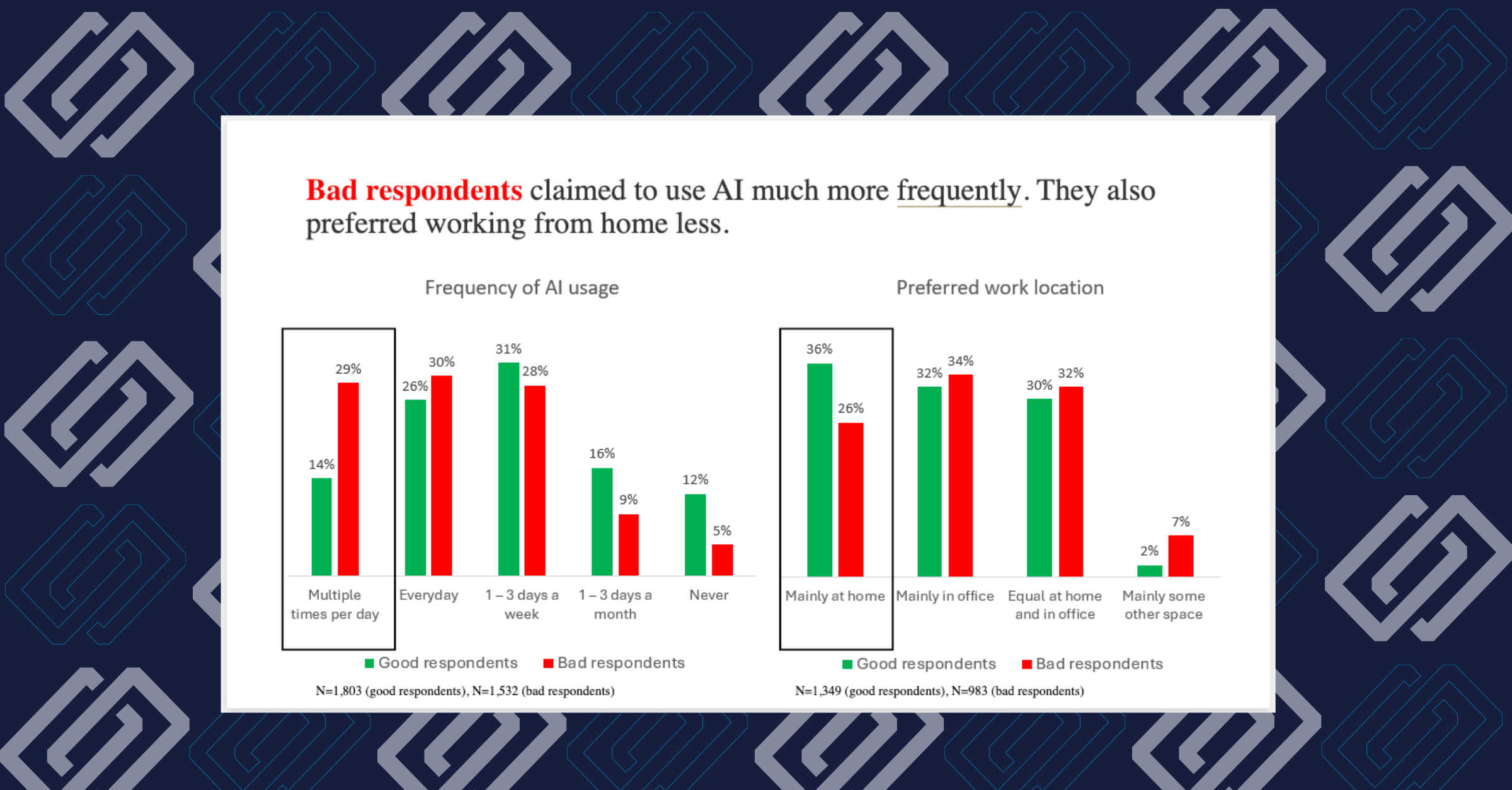 Bad respondents showed systematically different behavioral profiles, including significantly higher claims of daily AI usage, compared to good respondents. This pattern of over-claiming extends to pricing and purchase intent questions. Consider what that chart is showing. Bad respondents were roughly twice as likely as good respondents to claim they use AI multiple times per day. That’s not a random data artifact; it’s a pattern consistent with survey panel fraud: respondents systematically misrepresenting their behavior in ways that appear plausible but don’t reflect reality. The same tendency that inflates AI usage claims also inflates willingness to pay, distorts purchase intent, and produces economic responses that no real customer would give you.
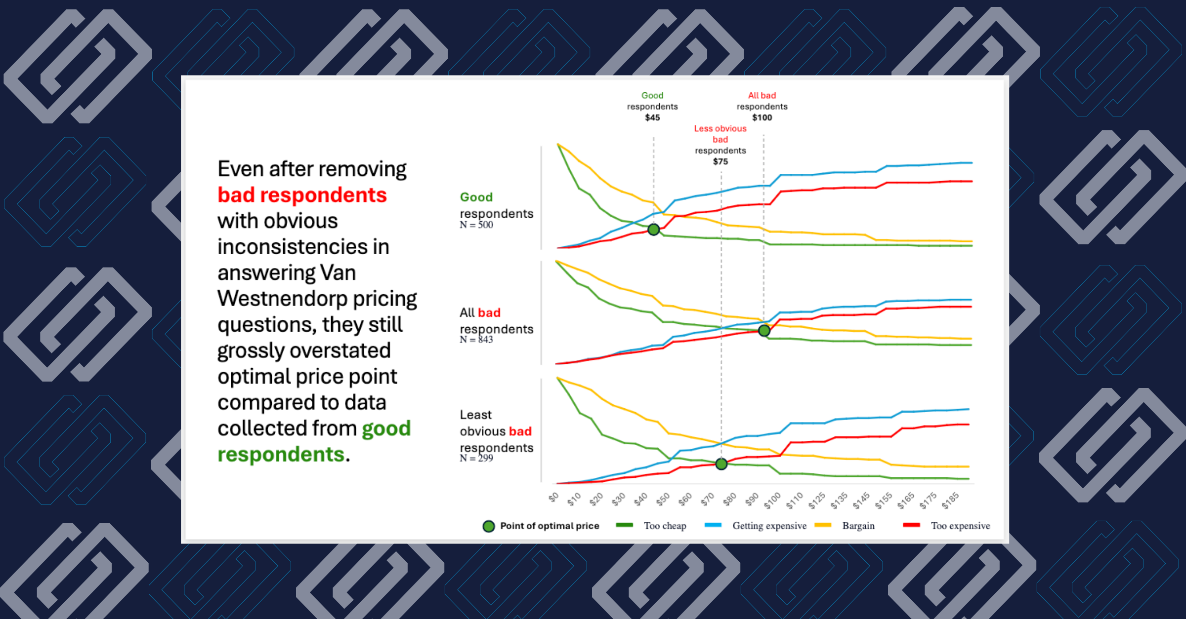 Van Westendorp price sensitivity results by respondent quality. Good respondents (N=500) produced an optimal price of $45. All bad respondents (N=843) produced $100. Even the ’least obvious’ bad respondents (those who passed standard inconsistency checks) still produced a $75 optimal price, a $30 gap from the clean data result. A $55 gap in optimal pricing isn’t a rounding error. For a physical product, it’s the difference between capturing your core market and pricing yourself out of it. For a SaaS product, it can mean building an entirely wrong tier structure from the ground up.